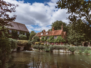
I've had some sample invites come and I wondered which you'd pick! Not looking at the colours at the moment (that's a whole different thread ?), just the layout/style...

1) This is the simplest one and I like that it's unfussy - it has the map and order of the day on the upper flap, with the invitation itself on the lowe flap - when it's shut, you just see our names along the edge. Downside is that I worry that I won't get all the information I need on to it and it will involve getting separate RSVP cards and including a whole lot of loose information in with the invite, which makes the simple style somewhat redundant!
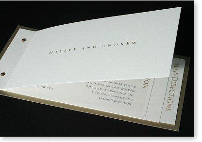
2) These are the chequebook style ones I thought I'd like best - but on seeing the sample I'm not so sure anymore. There's a lot of blank space but that might just be how the sample is done and it could be gotten around by double sided printing. I don't know though, they just didn't grab me as much as I thought they would.
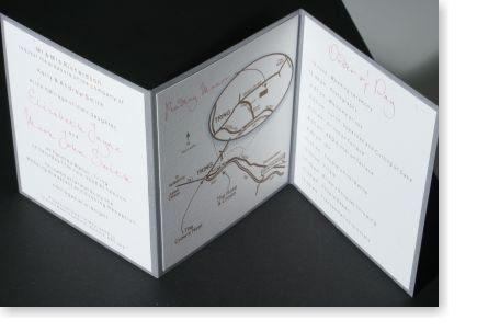
3) I think this is my favourite based on initial reaction. There's also the option to have a smaller tear-off flap at the end which is the RSVP card printed with a return address already! I like the bigger map and having two further sides to put all the information. But is is too big? Each one of these comes in a parchment wallet 
OH thinks they are all 'nice' but 'a bit plain' though I haven't been able to get him to expand on what he means by this or how he'd make them better!! I tend to like simpler designs so we may not agree on the invites easily!
Which do you like best? Or do you think I should keep looking?


