
Post content has been hidden

To unblock this content, please click here

Snow Patroller

Is this invitation design depressing?!

Snow Patroller, 13 June, 2008 at 13:34 Posted on Planning 0 10

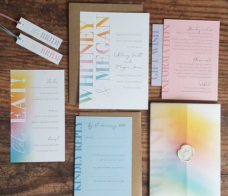
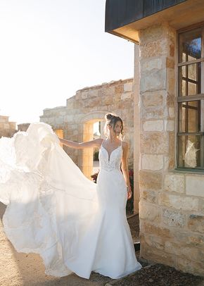
I'm coming up with some ideas for a friend of a friends wedding - she has no theme colour at the moment ... I have a few that are the classic (typical?!) purples/pales/ivory hues but also did this one. 2 folk (older people!) have said 'urgh, it reminds me of a funeral' ... and hubby said it was a bit in ya face ... any thoughts?

10 replies

Latest activity by twinks, 13 June, 2008 at 16:53
  • lisaloulou
    Beginner
    lisaloulou ·
    • Report
    • Hide content

    My completely honest answer is that I love big prints but I'm afraid I'm not keen on that one. I'm not sure whether its the colours or the print but something isn't quite right. Its a nice idea though but perhaps just needs a bit more tweaking.

    However, who cares what I think!! See what the friend of your friend thinks!

    • Reply
  • R
    Beginner August 2009
    Royalty ·
    • Report
    • Hide content

    I don't like it tbh, i can't put my finger on what it is i don't like though.

    Sorry

    x

    • Reply
  • Kate84
    Beginner August 2009
    Kate84 ·
    • Report
    • Hide content

    I am not the paragon of taste but TBH maybe its the green, or the band across the middle, or the flowers are too big or something. I love these kinds of designs though. I want to go a bit William Morris-y for my invitations, but in wedding colours and smaller motifs. Have to think of colour schemes first !

    • Reply
  • claires
    Beginner July 2008
    claires ·
    • Report
    • Hide content

    not a fan, sorry.

    its too dark i think thats why am not keen

    • Reply
  • M
    Beginner September 2007
    MrsKitty ·
    • Report
    • Hide content

    I am with Lisa in that I love big and bold prints too but also agree that there is something about that one I am not keen on. I don't find it depressing and I actually like the colours, I think it just seems a bit disjointed. The main reason for this is because the image does not flow from top to bottom IYKWIM, rather than using two exact copies, it should be one image that covers the whole of the front and I also think the text should be at the bottom so that the image can 'shine' (sorry can't think of a better word) without being cut in half.

    Sorry if that makes no sense at all and like Lisa says, what do we know, it is your customers thoughts that matter the most!

    • Reply
  • Snow Patroller
    Snow Patroller ·
    • Report
    • Hide content

    Thanks ladies - all views gratefully received. I agree that maybe these types of prints should be one flowing sheet - this paper comes in thin banner size only so its one bit top and bottom.

    Will investigage alternatives! Defo want to give her a bold invite as well as more 'lady' invites (iyswim) but its just finding the right print. Think I need to go craft shopping!

    • Reply
  • tahdah
    Beginner September 2009
    tahdah ·
    • Report
    • Hide content

    The colours are ok but I hate the font,

    perhaps if you just had the print in a block with a white border?

    • Reply
  • TheCakeNinja
    TheCakeNinja ·
    • Report
    • Hide content
    View quoted message

    WSS Def the font doing it for me

    • Reply
  • Laura_Lee
    Beginner
    Laura_Lee ·
    • Report
    • Hide content

    What if the flowers were up the other way? Bit like this;

    The flowers just look a bit 'happier'... ?

    • Reply
  • willownat1
    Beginner September 2008
    willownat1 ·
    • Report
    • Hide content

    I love the colours, but as Laura said I think it would look better with them vertical. Also I hate that font, sorry!

    And I do agree with others saying it needs to be a continuing print

    • Reply
  • twinks
    Beginner January 2009
    twinks ·
    • Report
    • Hide content

    Kind of going against the grain a bit, but i actually quite like it. I like the print, and it's a bit different (I am someone who's having black invites i think though, so probably not the best person to talk to about it being dark!!).

    I like it better vertically though like in Laura's post...

    I think the design bit is sometimes the funnest (hmmm, not even a word i don't think ?!) part though, trying things out and seeing what people think ?

    • Reply

You voted for . Add a comment 👇

×


Related articles

Premium members

  • Q
    Qa Test I got married in August - 2022 North Yorkshire

General groups

Hitched article topics

Contest icon

Win £3,000 for your wedding

Join Hitched Rewards, where you can win £3,000 simply by planning your wedding with us. Start collecting entries, it's easy and free!

Enter now