
Post content has been hidden

To unblock this content, please click here

B
Beginner June 2015

opinions on my invites please?

Brooksy, 13 August, 2014 at 11:28 Posted on Planning 0 3

So, even though I know it is still a while away i have been working on my stationary. We have decided to design everything ourselves and then have them printed. I have hit a bit of a creative block, so I need you lovely ladies to help me!

This is my invite...


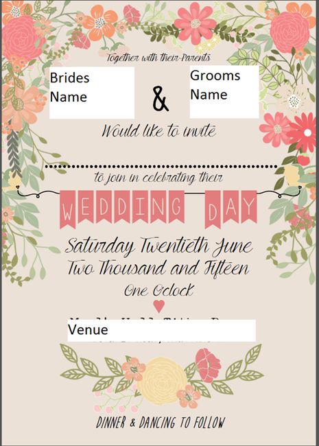
And I do like it, the flowers are very in keeping with the day but I think the colours need to be changed for something more pastel to fit with the colours on the day, but aside from that, I just feel like it is missing SOMETHING or it is just not quite right somehow. OH just keeps saying yes, it's fine... which is no help!

Feeling really stuck on it... any suggestions for what is missing/needs changing - please be brutally honest and tell me if they are rubbish!!

Thank you Smiley smile

3 replies

Latest activity by missmoore, 13 August, 2014 at 12:11
  • pammy67
    Beginner April 2015
    pammy67 ·
    • Report
    • Hide content

    I don't think they are rubbish, far from it. I love the colours and the design. The only thing I would say is they might be a little flat. I don't know if you're planning to include more information and perhaps an RSVP card, in which case you could build it into a little pack with a belly band or ribbon/twine tie to give them some depth. Are you planning to put anything on the reverse? To me I like just a little something on the reverse as this gives a better quality look.

    On a proof read look though Parents should be parents. I also think the join in celebrating sounds wrong, perhaps join them in celebrating, or join them as they celebrate

    But I like them.

    • Reply
  • lolapickle
    Beginner March 2015
    lolapickle ·
    • Report
    • Hide content

    These look great, love the font & the bunting.

    Have you tried using a different colour for the font? The black may be a bit harsh against the pastels. I'd also reduce the weight of your ........... line where you'll write the names.

    • Reply
  • ATB
    Beginner August 2014
    ATB ·
    • Report
    • Hide content

    I love the colours!

    • Reply
  • missmoore
    Beginner January 2012
    missmoore ·
    • Report
    • Hide content

    I think theyre lovely, however I agree that the dotted line looks a little bit heavy! I'd also move the 'together with their parents' down a tad just so they arent covering the flowers.

    Also, do you need to hand write the names on the front? I just think it creates a lot of work for you and unless you have amazingly neat handwriting it may start to look a bit fussy - As long as you write the names of each guest on the envelopes you wont need to worry about people not knowing who is invited!

    Anywhoo - just my personal opinion (don't shoot me!)- They are pretty as they are though!

    • Reply

You voted for . Add a comment 👇

×


Related articles

Premium members

  • Q
    Qa Test I got married in August - 2022 North Yorkshire

General groups

Hitched article topics

Contest icon

Win £3,000 for your wedding

Join Hitched Rewards, where you can win £3,000 simply by planning your wedding with us. Start collecting entries, it's easy and free!

Enter now