


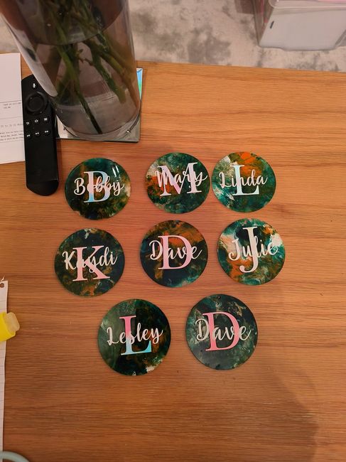
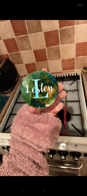
I'm after peoples opinions please! 
We're making our own place cards for our wedding reception, we cannot decide if it looks better like the photograph or with just the names on?
The large letter is in holographic vinyl & the name in white - the photo isn't the best due to poor lighting 
These will sit on white napkins on the tables, with white ribbon through the hole (to make a hanging effect)
Any help is appreciated as I've already re-done them once because I didn't like the colour 